
Notes on publishing using Lulu (part 1)
published: Thu, 5-Oct-2006 | updated: Fri, 5-Aug-2016
Now that I've republished The Tomes of Delphi: Algorithms and Data Structures through Lulu, it's time to reflect a little on what the entire process was like. That way, if you are also thinking of writing a book and self-publishing it through a print-on-demand (POD) service, you'll have a better idea of what you can expect.
First off, I'll have to admit I didn't do that much research on which POD provider I was going to use. Back when I got back the copyright for the book, I briefly looked at CafePress, but when I finally wanted to do something about it, I chose Lulu based on some thoughts and experience expressed by others. So far I've been really happy with them.
Book publishing choices
Having got that out of the way, let's jump into the book preparation. Lulu gives you essentially two different ways of uploading your content: a word-processing document (Lulu supports Microsoft Word, Microsoft Works, or OpenOffice) or a PDF. For me, there was only one choice: PDF. The reason was simple: I wanted full control over the look of the content and especially full control over the fonts. Lulu only offers a small list of eleven fonts (including Times New Roman and Arial) and so if you upload a word-processing document you'll have to use one or more of that list, or face your font choices being changed by the Lulu PDF converter.
I chose PDF because, first, I wanted a particular choice of fonts, and, second, with PDF you can embed all the fonts inside the document. I suppose also, third, it's the format they use for printing anyway, so, provided I took great care over my formatting, I would know exactly how it would come out. WYSIWYG in other words, or perhaps WYPDFLLIWYG (What Your PDF Looks Like Is What You Get).
The next choice I had to make was the size of the book and its binding. First it had to be a paperback: I'm not that vain to want to do a hardback, plus the hardback would have been really expensive. The original book was perfect bound (that is, the leaves are glued along the left hand side to the spine to give a nice square look), so that was the option for me. The size though was annoying. In general, computer books are 7.5" x 9.25" and that's what I wanted, but Lulu don't offer that size. I did toy with the idea of using an unusual size (7.5" x 7.5" square, perhaps? 8.5" x 11"? Certainly not!), but in the end I chose what Lulu call Crown Quarto, which is 7.44" x 9.68". So, about the same width as other computer books but almost half an inch taller.
For that size of page Lulu uses 60lb paper (90 g/m2) which is thick enough that you can't read the other side's text through the paper. The paper they use is bright white (96). (For comparison, the paper I use in my inkjet at home is HP Multipurpose Paper, which is 75 g/m2 and 92. Lulu's paper is therefore 20% heavier and much whiter than what I print on ordinarily.) I don't know what Wordware used in the original book, but it's heavier and less white.
I deferred thinking about the cover at this stage. It would be glossy color, no matter what, since that's only what Lulu gives you as an option, but I wanted to get back to the text.
Whitespace
Now that I'd decided what size book I was going to create, I could set up the page size in Word (the Page Setup dialog). The next decision though was how large to make the margins and the gutter. Enter whitespace, the term that brings dread into the hearts of non- graphic designers like me, and scorn from anyone who hasn't had to worry about it before.
All the advice you read about text layouts say that you should have whitespace. Whitespace serves to give definition to different blocks of text (like paragraphs), to help your eye track the individual lines of text on the page, to provide a restful feel to the page. OK, there was nothing for it but to solve all the whitespace issues in one fell swoop.
First up, I cheated a bit on the margins and the gutter: I just used the same values that Wordware had done for the previous book. (By the way, the gutter is that dead space right next to the bindable edge of the page. Because you can't fully open a book, there's a strip of paper next to the binding that you can't really use since to read text there would mean breaking the binding as you force the book to open even further.) So the margins were 1" top, 0.6" bottom, 0.5" inside and outside edge, and 0.7" gutter. The top and bottom margins gave me plenty of room to put the header and footer.
Next, I played the same trick as the Wordware typesetter had done: I indented the body text by a further 0.8" on the left. That gave me even more whitespace on the left, and also gave me a chance to outdent the headings so that the different parts of the text were even more differentiated. The main text therefore was a smidgeon less than 5" across. Yes, one third of the page across the width of my book is whitespace.
Font issues
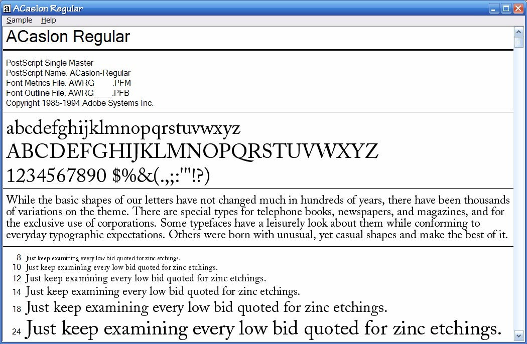
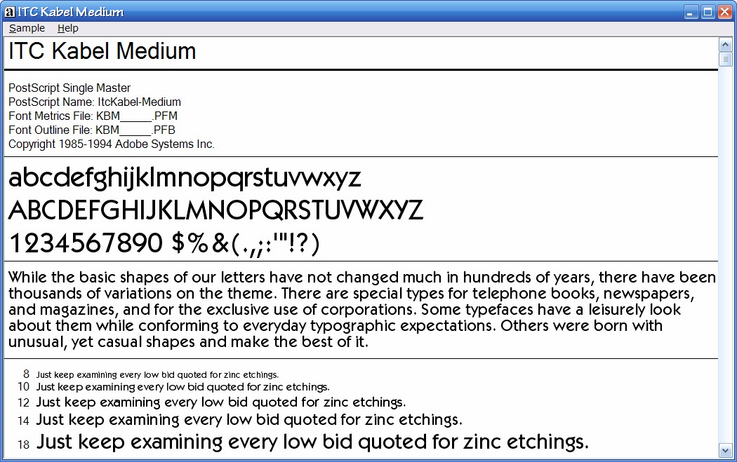
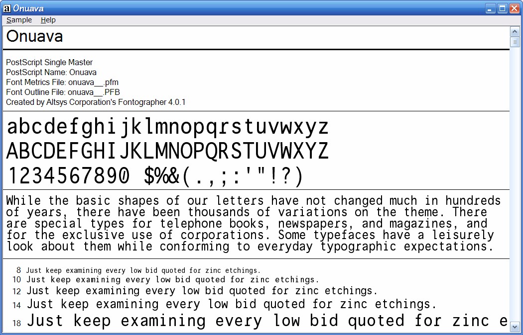
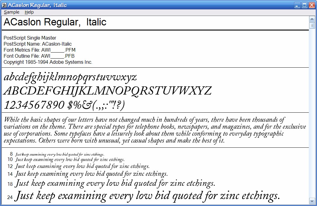
The decision about the fonts was next on the list. Actually I'd bought them for the original book, but Wordware didn't want to use them since they wouldn't have been the same as their other books. The text is in Adobe Caslon Regular 11pt, the headings in ITC Kabel Medium from 11pt to 20pt, and the code in Onuava 8pt. The Caslon font has an impressive history: it was invented by William Caslon in the 18th century and was used to typeset the US Declaration of Independence. It's a serif font which I find very easy to read, since the ascenders and descenders are equal in size and larger than usual (which adds to the whitespace!). It also has a lovely old-fashioned feel to it and the italic forms are just awesome. ITC Kabel is a sans-serif font that's a favorite of mine: it's derived from the Bauhaus movement from Germany between the wars when art, architecture, and typography broke free of its more ornamental forms, and so feels very clean. I feel it goes well with Caslon, especially to differentiate the headings from the text. I'm afraid I'm less happy with Onuava: it's a monospace font (with a couple of cute letterforms: check out the 'r') I'd bought a while back, but I didn't notice that its bold letterforms are wider than the normal forms until it was too late. So the code looks a little wacky, and the figures that explain sorting with cards in chapter 5 get this ragged right edge.
Once all this had been decided (as well as other things like the leading for lines of text and space before paragraphs and all the other myriad things), it was time to apply all the different styles to the text. Luckily, when I first wrote the text, I'd written it in Word and I'd been very vigilant about creating and using styles. I cannot recommend enough that you should use styles for your paragraphs. Making individual changes to each paragraph is a sure way to insanity, it really is. For example, my book has 8,500 Code paragraphs, 1,500 Normal paragraphs, 289 Heading 4s, 99 Heading 3s, 79 Heading 2s, and 14 Heading 1s. Imagine having to change that lot if you hadn't used styles and you wanted to play around with the formatting.
And make sure to use a minimum number of styles. Having too many will approach the previous problem where there are too many things to change when experimenting with the look.
Front matter
Once all the important content was set up and formatted the way I wanted (and I'd written a preface to the second printing), it was time to think about the front matter of the book. (Note that Lulu adds absolutely nothing to the pages that form your book. They don't add any front matter. If you want the copyright information, etc, it's up to you to write it as part of you book's document.) I didn't really want too much, so the very first page had the title of my book writ large, the second had the copyright and trademark information and the legal "if you shoot yourself in the foot with this book or its contents don't come crying to me" stuff. I cut out the ISBN and the Library of Congress CiP information from the original book since they no longer applied. For all this I basically copied the form if not the text from several other books. Page three was the dedication, page four deliberately left blank, and then page five onwards was the Table of Contents, generated by Word.
(A quick word about ISBN numbers. If you are going to publish a book that you would like to sell or distribute or have other stores stock or have it on the shelves at B&N, you need an ISBN number -- a 13- digit one from 1 January next year, so that basically means from now onwards -- and an ISBN barcode on the back cover of the book. Lulu has an extra cost plan for $99.95 which provides you with an ISBN number, the barcode on the back of the book, and extra distribution services. Note though that ISBN are supposed to be unique and fixed to the content; make material changes to the content and you need another ISBN. Also, bizarrely, if you do use Lulu's distribution service, you can't use the page size I chose. I don't know why.)
At this point, I spent quite a bit of time going through the Word document, making sure that there weren't any huge blank spaces caused by the figures, re-arranging text around them to fill up the blanks (I'm chagrined to say I missed a huge blank space on page 371). The more time you can spend in this task the better the book will look. There's also the headers and footers to fix (in Word that means setting up sections, the second most awful thing I ever had to do when typesetting a book -- for some reason the section functionality in Word conspires to trip me up at every turn).
The index
The reason for doing this, and doing it well, is the index. Although Word has some indexing functionality, I've never really managed to get it to work properly. So I do it by writing a separate text file with keywords and phrases and page numbers where they appear, with one keyword and page number per line. Once that's done, you sort the text file with the command line SORT command, tidy it up, merge equal words, clean up singular versus plural problems, add in the "See" references. Finally you import this into your Word document at the end. You do not want to touch anything in the document prior to the index at this point, otherwise you might cause a repagination and your index will be wrong and you have to start over. This is not pretty. Grown men have been known to cry and throw objects across the room, denting the wall.
Eventually you will have a single Word document, properly formatted, with a good Table of Contents and index and you are ready to convert it to PDF. For heaven's sake, make a backup copy of this document on a CD now. Preferably two. It represents a lot of fiddling around, rearranging stuff, making it pretty. You do not want to lose this work. It's tedious to redo, and you might never get round to it again.
Generating the PDF
When I did this generate-the-PDF step before for another book, I used a third-party printer driver that printed to PDF. DON'T DO THIS. I cannot tell you how many times it didn't work properly on such a large document (and I tried two different drivers). I'm sorry to tell you this, but you'll need the precise control that Adobe Acrobat has. Beg, borrow, or steal a copy. (Well, preferably not the latter.)
Open up Adobe Acrobat. Go to the Preferences dialog, select the "Convert to PDF" option, and click Edit for the Microsoft Office settings. Go to the Fonts tab. What you want to do here is to ensure that all the fonts you use are embedded in the PDF. Do not rely on the printer having the right fonts (we used to do this when printing manuals at TurboPower too). So check the Embed all fonts checkbox, and -- important -- clear the Never embed list box. This will ensure that all of the fonts that you used in your document are embedded in the PDF and that you are not relying on the printer having the right ones (or the versions you have). Click OK to save your changes.
Now open up your massive book document inside Acrobat and convert it. For my book it took between 20 and 25 minutes, including several times when the progress bar seemed to stop. Don't panic, and instead go to Starbucks and order a celebratory latte: you've plenty of time.
Once the conversion has taken place, check the new PDF. Load it on another "bare OS" PC to make sure that the fonts are properly embedded. Make sure that the PDF looks the way you wanted. Look at the headers and footers, front matter, the index, flip through the content. The PDF has to be perfect, because the next step is uploading it.
So, next time, we'll look at the actual publishing bit.
(For ease of browsing, here's part 2, part 3 and this is part 1 of this series on publishing with Lulu.)